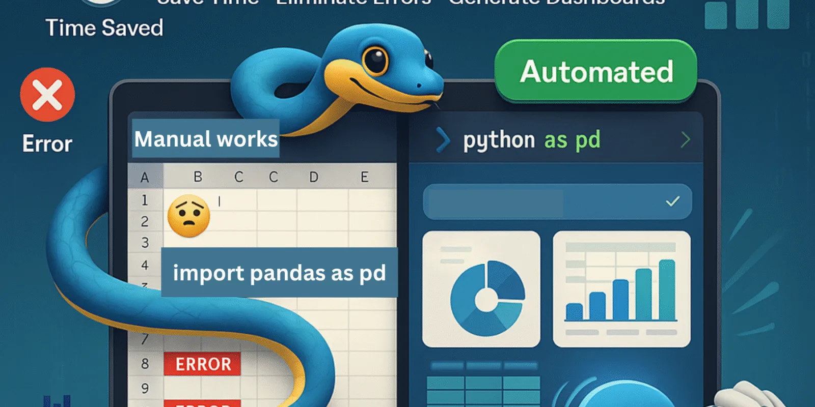
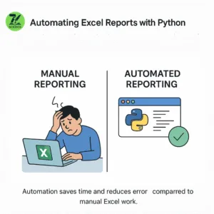
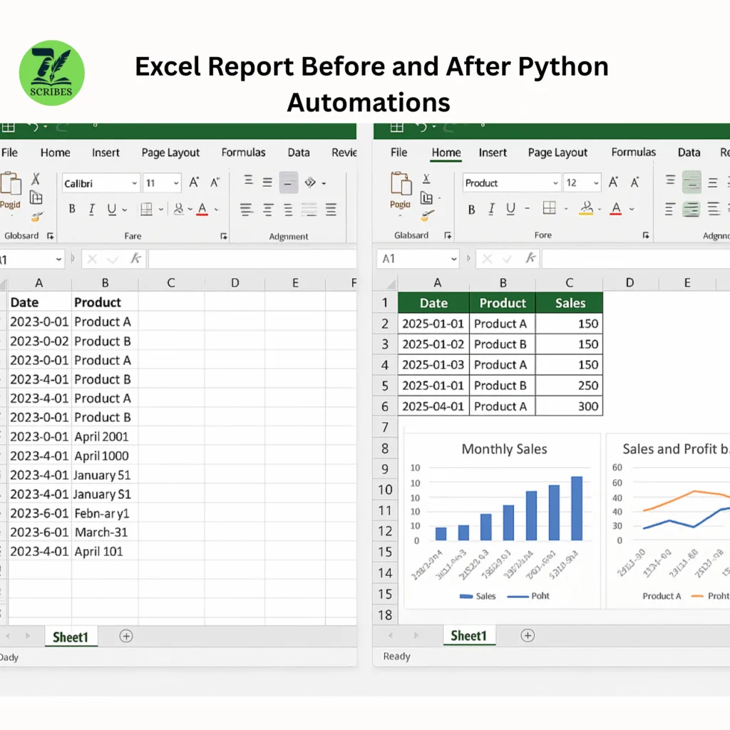
Excel reports are present everywhere. From sales tracking to inventory management, the company is dependent on Excel spreadsheets. Manually preparing and updating these reports is time-consuming and requires much labor. If you can automate it, you can save time as well as eliminate errors.
This is where Python comes in. It is a powerful but easy programming language. It allows you to automate repeated tasks, including Excel Report Generation. In this guide, we will show you how to create phased Excel reports using Python. There is no complicated word, just simple instructions and helpful tips.
You do not need to be an expert programmer. Whether you are early or you have some coding experience, this guide will help you create automation scripts that work.
Why automate Excel reports?
Let’s understand why automation is important:
- Time savings: Automating reports means that you do not need to repeat the same task.
- Reduce errors: Manual entry can lead to errors. Automation helps to ensure accuracy.
- Consistency: Automation makes reports in the same form each time.
- Focus on Analysis: Take less time in data preparation and more time to make decisions.
- Handle big data: Python can work easily with large data sets faster than Excel alone.
What do you need to start?
To automate Excel reports using Python, you will require the following items:
- Python Install: Download and install Python if you have not already done so, at Python.org and follow the instructions for installation.
- Basic Python Knowledge: You should have elementary knowledge of Python, such as how to execute the script and declare variables.
- Excel File: Keep up the Excel Report or dataset that you want to be updated automatically.
- Libraries of Python: You will need some packages to work with Excel files. They are Pandas, openpyxl, and XlsxWriter. We will explain them soon.
Tools and Libraries
Here are the main tools we will use:
• Pandas: This is a famous Python Library for data analysis. It can read, write, and manipulate Excel files easily.
• Openpyxl: This library allows you to read and write Excel files, especially for sales, fonts, and colors formatting.
• XlsxWriter: It is used to create Excel files with charts and advanced formatting.
• Plotly: (Optional) A library to create an interactive chart that you can add to your reports.
Step 1: Install the packages.
Open your terminal or command prompt and execute the following code.
pip install pandas openpyxl xlsxwriter plotlyThis installs all the packages.
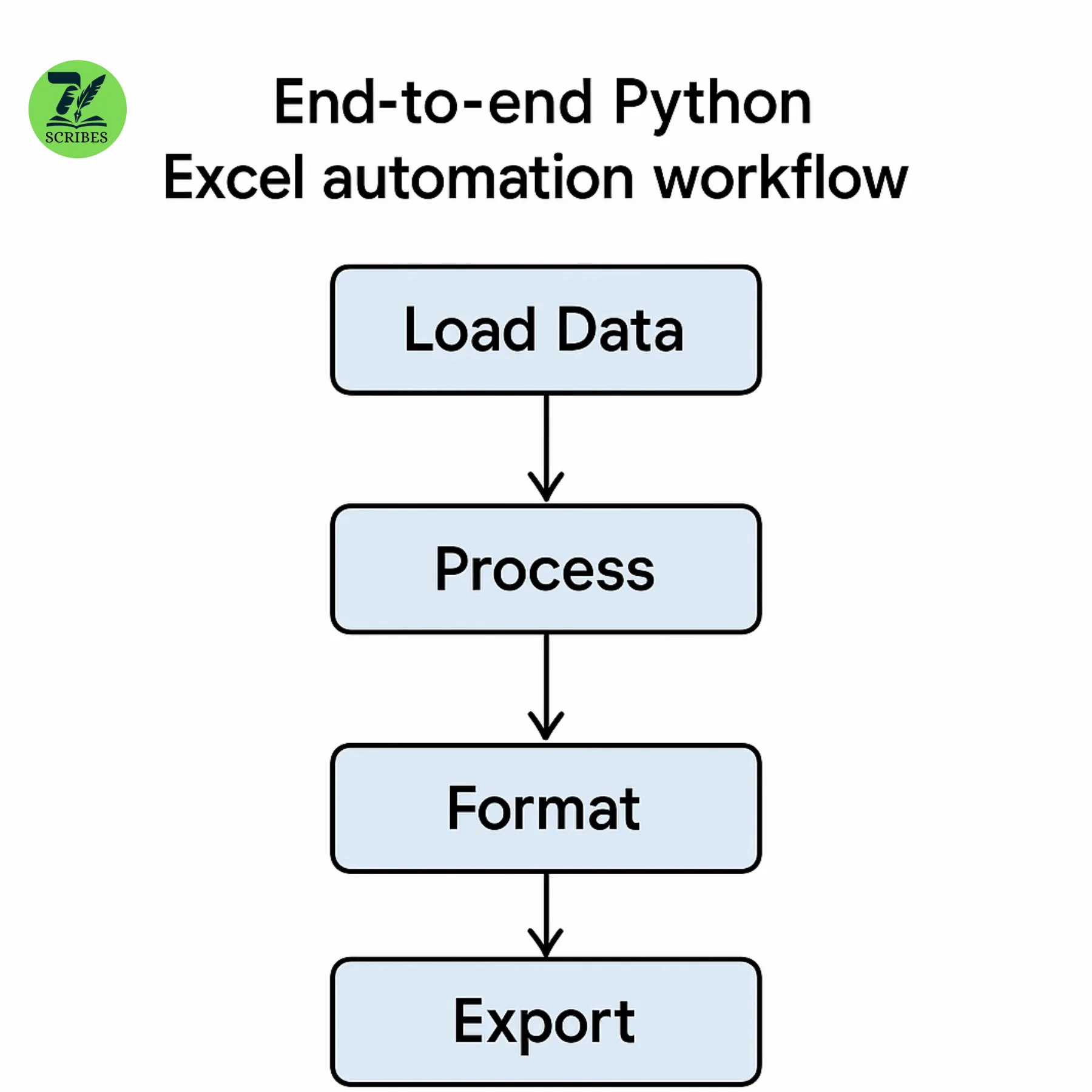
Step 2: Load your Excel data with pandas
First, you must import your Excel file into Python. Let us assume your filename is sales_data.xlsx.
Import Panda as pd.

df = pd.read_excel ('sales_data.xlsx')

Print (df.head ())
This loads the data and shows you the first few lines. You can now manipulate this data in Python.
Step 3: Add calculations or new columns
Consider you want to add the total sale of each product by multiplying the units sold by the price per unit. You can easily add new columns.
df['Total Sale'] = df['units sold'] * df['price per unit']Step 4: Save your new data back to Excel
Save it in a new Excel file once your data is ready:
df.to_excel('updated_sales_report.xlsx', index=false)It saves a new file called updated_sales_Report.xlsx
Step 5: Format your Excel report
Excel reports look better when they have colors and borders and fonts. This step makes your report professional.
Use openpyxl to read your Excel file and format it.

from openpyxl import load_workbook

from openpyxl.styles import PatternFill, Border, Side, Alignment, Font

wb = load_workbook('updated_sales_report.xlsx')

ws = wb.active
# Highlight header row
fill = PatternFill(start_color='FFFF00', end_color='FFFF00', fill_type='solid')

for cell in ws[1]:

cell.fill = fill

cell.font = Font(bold=True)
# Add borders around data
border = Border(left=Side(style='thin'),

right=Side(style='thin'),

top=Side(style='thin'),

bottom=Side(style='thin'))

for row in ws.iter_rows(min_row=2, max_row=ws.max_row, min_col=1, max_col=ws.max_column):

for cell in row:

cell.border = border
# Left-align text
for row in ws.iter_rows(min_row=1, max_row=ws.max_row, min_col=1, max_col=ws.max_column):

for cell in row:

cell.alignment = Alignment(horizontal='left')

wb.save('formatted_sales_report.xlsx')
This script highlights headers, adds borders, and left-aligns text.
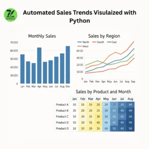
Step 6: Add Charts to Your Report
Charts enable us to view data. Use xlsxwriter or plotly to add a chart.
Here is an example using the Plotley:
import plotly.express as px

fig = px.bar(df, x='Product', y='Total Sales', title='Sales by Product')

fig.show()
You can even save this chart as an image and place it in your Excel file.
Step 7: Automate the Entire Process Using Functions
It is preferable to write function for specific work. This makes your script reusable and structured.
Example:
def load_data(filename):

return pd.read_excel(filename)

def add_total_sales(df):

df['Total Sales'] = df['Units Sold'] * df['Price per unit']

return df

def save_data(df, filename):

df.to_excel(filename, index=False)

def format_excel(filename):
# formatting code here
pass

def create_chart(df):
# chart code here
pass# Main script
data = load_data('sales_data.xlsx')

data = add_total_sales(data)

save_data(data, 'updated_sales_report.xlsx')

format_excel('updated_sales_report.xlsx')

create_chart(data)
Step 8: Create Pivot Tables Automatically
Pivot tables assist in summarizing large data. You can make a pivot table with pandas in Python.
Let’s say your data has columns such as sex, payment method, and total sales. You want to observe total sales by gender and payment.
pivot_table = pd.pivot_table(df,

values='Total Sales',

index='Gender',

columns='Payment Method',

aggfunc='sum')

print(pivot_table)
It will group data by Gender and Payment Method and then add up the total sales.
To save the pivot table to Excel:
pivot_table.to_excel(‘pivot_table_report.xlsx’)
Step 9: Visualize Pivot Table with Heatmap
You can also display the pivot table as a heatmap using Plotly. It provides a colorful representation of your data.
import plotly.express as px

fig = px.imshow(pivot_table,

labels=dict(x="Payment Method", y="Gender", color="Total Sales"),

x=pivot_table.columns,

y=pivot_table.index,

title="Total Sales by Gender and Payment Method")

fig.show()
It generates a heatmap displaying sales by gender and mode of payment. You can even save the heatmap as a picture to insert into Excel.
Step 10: Schedule Your Python Script
Running your report manually each day or week is still a chore. Rather, schedule your Python script to operate automatically.
How can you Automatically Run Python Script?
- Windows Task Scheduler (on Windows)
- Cron jobs (on Linux/Mac)
Example: Using Windows Task Scheduler
- Open Task Scheduler.
- Click on “Create Basic Task.”
- Assign a name to your task. e.g., “Excel Report Automation.”
- Select the schedule (daily, weekly, etc.).
- For action, choose “Start a program.”
- In Program/script, navigate to your Python executable (e.g., python.exe).
- In Arguments, enter the path to your Python script (e.g., C:\Scripts\report_automation.py).
- Complete and save.
Your script will execute automatically at the scheduled time.
Example: Using Cron Job on Linux/Mac
- Go to the terminal and enter:
crontab -e- Add a line like below to run daily at 9 AM:
0 9 * * * /usr/bin/python3 /home/user/report_automation.py- Save and exit.
Your script will now execute daily at 9 AM.
Step 11: Create an Interactive Dashboard with Dash
In case you want to view your reports in real time on a web page, Dash (a web framework) can assist.
Creating dashboards with dash charts and filters makes it simple.
Basic Dash Example:
from dash import Dash, html, dcc, Input, Output

import pandas as pd

import plotly.express as px
# Load data
df = pd.read_excel('sales_data.xlsx')

app = Dash(__name__)

app.layout = html.Div([

html.H1("Sales Dashboard"),

dcc.Dropdown(

id='group-by',

options=[

{'label': 'Gender', 'value': 'Gender'},

{'label': 'City', 'value': 'City'},

{'label': 'Payment Method', 'value': 'Payment Method'}

],

value='Gender'

),

dcc.Graph(id='heatmap')

])


@app.callback(

Output('heatmap', 'figure'),

Input('group-by', 'value')

)

def update_heatmap(selected_group):

pivot_df = pd.pivot_table(df, values='Total Sales', index=selected_group, columns='Payment Method', aggfunc='sum')

fig = px.imshow(pivot_df, title=f'Total Sales by {selected_group} and Payment Method')

return fig


if __name__ == '__main__':

app.run_server(debug=True)
It is a simple app that allows one to choose a category to put data in and displays a heatmap based on it.
Step 12: Wrap All Steps into a Script
Once you feel comfortable, wrap loading data, processing, formatting, pivot table creation, chart generation, and dashboard building into a single script or project.
This way, you have an entire workflow automated, and interactive.
Step 13: The best ways for automation
- Keep the backup: Always preserve the original data before running automation.
- Verify the results: Check reports to ensure the calculations are accurate.
- Logging errors: Use logging to track errors and achievements.
- Documentation Code: Write comments to help you in the future and clean the function names.
- Schedule carefully: Run automation when your system is free to avoid slow behavior.
Step 14: Troubleshooting Common Issues
- Missing Python Packages: Use pip install to add missing libraries.
- File pathway defects: Use the full file path or make sure your script runs in the correct folder.
- Permission denied: Make sure your script has the right to read/write Excel files.
- Data matching: Check with your script similar to Excel columns and names.
- Slowly executed: For large files, consider improving pandas or using small data sets.
Summary So Far
You have learned:
- How to read and write Excel files using Python.
- Add calculated columns to your data.
- Format Excel sheets for better appearance.
- Create pivot tables to summarize data.
- Visualize data with charts and heatmaps.
- Schedule scripts to run automatically.
- Build simple web dashboards with Dash.
Step 15: Advanced Excel Formatting
Formatting makes your reports more readable and professional. Let’s discuss some advanced formatting using the openpyxl library.
Example: Conditional Formatting
Highlight cells where sales are above a target.
from openpyxl.formatting.rule import CellIsRule

from openpyxl.styles import PatternFill

wb = load_workbook('report.xlsx')

ws = wb.active
# Define the fill color for values over 1000
red_fill = PatternFill(start_color='FFC7CE', end_color='FFC7CE', fill_type='solid')# Add conditional formatting for values over 1000 in column F
ws.conditional_formatting.add('F2:F100', CellIsRule(operator='greaterThan', formula=['1000'], fill=red_fill))

wb.save('formatted_report.xlsx')
This colors cells with total sales above 1000 in red.
Step 16: Add Charts Directly in Excel
Rather than images alone, you can add Excel-native charts programmatically.
The following is an example of adding a bar chart using openpyxl.chart.
from openpyxl.chart import BarChart, Reference

wb = load_workbook('formatted_report.xlsx')

ws = wb.active

chart = BarChart()

data = Reference(ws, min_col=6, min_row=1, max_row=ws.max_row) # Assuming column F has sales data

categories = Reference(ws, min_col=1, min_row=2, max_row=ws.max_row) # Column A has product names

chart.add_data(data, titles_from_data=True)

chart.set_categories(categories)

chart.title = "Sales per Product"

ws.add_chart(chart, "H10") # Add chart beginning from H10 cell

wb.save('final_report.xlsx')
Step 17: Build Custom Excel Templates
Rather than generating a new report each time, you can develop an Excel template with styles, logos, and headers.
Your script populates data and saves it as a new report.
Step 18: Read Multiple Sheets and Big Data
Actual reports usually consist of more than one sheet.
You can read, edit, and write Excel files consisting of multiple sheets using pandas and openpyxl.
Example: Reading multiple sheets
xls = pd.ExcelFile('multi_sheet_data.xlsx')

print(xls.sheet_names)

df1 = pd.read_excel(xls, 'Sheet1')

df2 = pd.read_excel(xls, 'Sheet2')
You can process each sheet individually, then write results to new sheets.
Step 19: Email Automated Reports
Email your Excel reports automatically.
Use the smtplib and email libraries.
Example:
import smtplib

from email.message import EmailMessage

msg = EmailMessage()

msg['Subject'] = 'Automated Sales Report'

msg['From'] = 'your_email@example.com'

msg['To'] = 'recipient@example.com'

msg.set_content('Please find the attached sales report.')

with open('final_report.xlsx', 'rb') as f:

file_data = f.read()

file_name = 'final_report.xlsx'

msg.add_attachment(file_data, maintype='application', subtype='vnd.openxmlformats-officedocument.spreadsheetml.sheet', filename=file_name)

with smtplib.SMTP_SSL('smtp.example.com', 465) as smtp:

smtp.login('your_email@example.com', 'password')

smtp.send_message(msg)
Replace the email addresses and SMTP server details with your information.
Step 20: Track Changes and Keep Logs
Make logs to capture when your automation executes and any errors.
Example:
import logging

logging.basicConfig(filename='automation.log', level=logging.INFO, format='%(asctime)s - %(levelname)s - %(message)s')

logging.info('Report generation started.')
try:
# your code here
logging.info('Report generated successfully.')
except Exception as e:
logging.error(f'Error: {e}')
Logs assist in debugging later.Step 21: Use Virtual Environments
Keep your Python projects clean by using virtual environments.
python -m venv env
source env/bin/activate # Linux/Mac
.\env\Scripts\activate # Windows
pip install pandas openpyxl plotly dash
This avoids package conflicts.
Step 22: Real-world use cases
- Sales reports: daily sales, high products, and areas.
- Inventory management: Track the stock level, reset alerts.
- Financial Reports: Expenses, income, and profit analysis.
- Marketing: Campaign performance, customer distribution.
- HR: Attendance records, payroll summary.
Step 23: Tips for Better Reports
- Use clear column names.
- Add summaries and totals.
- Use charts to highlight trends.
- Automate repetitive tasks.
- Validate data for accuracy.
FAQs
Q1: Do I need to know Advanced Python to automate Excel reports?
No, you don’t need modern skills. It is enough to know the basics of Python and a few libraries to start. You can improve your skills as you go.
Q2: Can I automate reports with large Excel files?
Yes, you can do it. But if your files are really big, it’s a good idea to improve your code and process the data into small pieces.
Q3: Is it difficult to learn Dash?
The dash is initially friendly and uses only Python. JavaScript is not needed.
Q4: Can I schedule an automation on Mac?
Yes, use Crown Jobs or Automator to schedule the script.
Q5: How safe is sending reports via email?
Use safe SMTP servers and encryption where possible. Avoid sending sensitive information to unsafe email.
Read More:


Leave a Comment
Your email address will not be published. Required fields are marked *
No Comments Yet
Be the first to share your thoughts!